
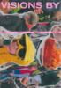
Visions By 7
More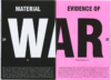
Scientific research publication for a design university.
Plot
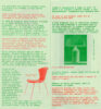
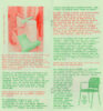
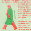
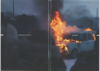
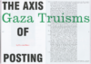
The journal seeks to expand the concept of materiality through scientific research articles. Following this same principle, the design combines the classic format associated with these publications with unconventional graphic elements, incorporating aspects specific to the themes explored in the various texts.
Client
Agency
Services
- Editorial design
Collaborators